The Problem
Streamline a time consuming, manual, and frequently frustrating ad campaign creation process, then make it available to a wide set of users.
Optimize the managed product
Transition away from static ads
My first task was to facilitate a shift from precomposed banners to modular units composed of advertiser-supplied text and image assets. This cut the time required to create and approve standards-compliant banners from hours to minutes, and expanded eligible placements from two to any of the dozens of places third-party ad units could run. The strategic intent was leverage reuse and flexible templates to increase coverage while reducing ops costs.

A sample first-party ad on the home page
Improve the campaign creation workflow and tool
We then replaced the spreadsheet-based management process with a web UI for creating, previewing, and managing campaigns. Discovery with our advertising team highlighted three scenarios:
- Create or update individual campaigns
- Review setups and creative for validation
- Manage accounts and access for the tasks above
We reduced roles to two: users who build and optimize campaigns, and admins who manage access. With this in mind, we specifically began creating and testing workflows with our users, designed to reduce repetitive work and the opportunity for errors. The final tool supported multiple campaigns per advertiser and multiple ads per campaign, each with its own creative, placement, targeting, and budget.

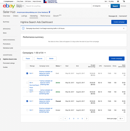
Wireframes for the new internal management tool
By the end of this phase, we had a product that could support all of the features required to open it up to a new class of users: the advertisers themselves.
Self-service transition
Although the new product was more efficient, its reliance on an internal team excluded the largest cohort of eBay sellers – small and midsize businesses. The ads team set a goal of launching a self-service beta by mid‑2018 to validate the product concept as viable from a quality, safety, and performance perspective, and I began to design a tool that could be used on day one with no training by using plain language and opinionated defaults.
Limitations
First, we evaluated integration with the existing promotional tools (discounts, bundling, coupons, etc.) but, as none of the existing tools could be easily extended, this was quickly moved to out-of-scope. Second, we’d also have no capacity for manual content reviews, so leadership made the controversial decision to ship without any content review, even though I (and others) highlighted the obvious risks that users would not adhere to the rules and guidelines presented.
Insights
After reviewing existing seller research and adding surveys on expectations and needs for advertising, I had 3 key principals to guide my design decisions.
- Sellers know their inventory and consider themselves domain experts.
- Marketing is a small, end‑of‑day task; speed and simplicity beat full customization.
- Needs aligned with a value proposition of self‑service with heavy automation.
These surfaced as we completed our first usability tests. Category selection was overly complex; so we simplified the selection UX. Budgeting early in the flow created friction – we moved it later and reduced the amount of math for advertisers. For reporting (post‑beta), sellers cared about sales growth and efficient spend, not peer comparisons.


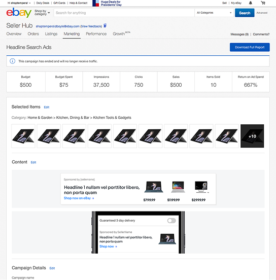
V1 product mockups
Beta launch
We opened access to 200 sellers and guided them through a three‑step creation flow before letting them create their first ad.
Key metrics:
- Click‑through rate
- Ad sales
- Return on ad spend (ROAS)
Outcomes
Tracking from actual ad campaigns indicated the product could work – returning positive ROAS when ads featured recognizable brands and real discounts – which signaled the need to integrate with seller promotion tools (bundles, discounts) to improve creative inputs. The other choice, to allow free-form content without review immediately caused quality and trust issues with campaigns, leading to an immediate change to allow only pre-vetted campaign text – preventing sellers from advertising discounts and bundles.
This meant our two limitations would prove to be blockers for long-term adoption.
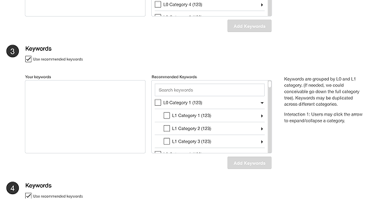
Other changes would be easy to address in iterative changes. Among our dissatisfied users, the top complaint was a lack of transparency and controls around keyword targeting, which was originally abstracted to simplify the campaign creation process and limit spam. To address this, I created a UX that would provide an option for more visibility into the process and worked with the science team to create a workflow that would allow customization of the keywords without risking harm for our buyers.
Restrospective
Not every project can be a winner, but the important thing is that failures don’t carry a high cost and that we learn our lessons. In this case, I learned an important lesson about standing my ground and escalating when obvious danger signs appeared.
I transitioned to management when this project was completed, providing me with a new perspective on this problem, and invested time learning how to prevent my new team from encountering the same problem.


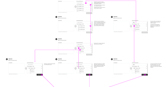
Wireframes for keyword targeting and performance tracking updates
