The Problem
Although usage of KDS was mandated, it had stagnated: outdated visuals, limited evolution, and difficult to build with. My goal was to make it a system people wanted to use by reconnecting designers and developers, modernizing the foundations, and setting processes that would ensure we continued to evolve.
Working as a team
To build trust with partners frustrated by past leadership, we established three guiding principles:
1. Code is truth
Users don’t interact with Figma, they interact with code. Figma is, at best, and abstraction of that truth. This mindset transforms developers into co-owners from hired hands.
2. Equal partners
We ask questions instead of giving orders, assume positive intent, and treated disagreements as learning opportunities.
3. Common goals
We agreed KDS should be “better tomorrow than today.” I partnered with organization-level leaders on a shared roadmap, preventing burnout and aligning annual planning priorities.
The secret? I had a plant. I had been quietly working with the team’s dev manager for a few months, and he could vouch for me with the development team.
Contribution processes
Making a ‘living’ design system
The first challenge was restarting intake for components and patterns. We designed a contribution process informed by past lessons, then stress-tested it with long-requested components. The resulting process emphasized low-fidelity exploration, open feedback, internal testing, and usability validation.

A visual depiction of the intake process
The most complex was a Data Grid which would standardize the display, sorting, filtering, and manipulation of data in our large, complex tables. This was created over the course of 8 months, with the multiple product teams providing requirements, design and engineering support, and feedback.
Visual refresh
Creating a better baseline look-and-feel
KDS's foundations created problems for builders and end-users. Colors had vague names like Nordic instead of semantic tokens like primary text, leading to inconsistent usage. Our visual design wasn’t implemented with basic usability in mind—only 73% of users could correctly identify active UI elements on a sample page.
We introduced:
- New color ramps mapped to semantic tokens
- A typography scale independent of HTML tags
- Updated styles for all components
- Rules for custom component creation

Example test screens showing the difference between old and new styling
We tested with abstract exercises and real product scenarios. Usability scores improved dramatically: interactive elements were identified 95% of the time in light mode and 98% in dark mode, with positive user feedback on the overall look-and-feel. Six A/B tests validated our in-place update strategy. While financial metrics didn’t move directly, feature adoption and engagement increased, leading to a 2024 launch which saw changes delivered automatically to our product pages with minimal work required.

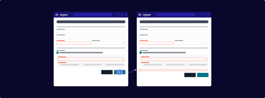
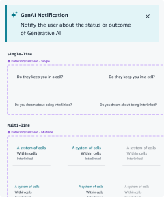
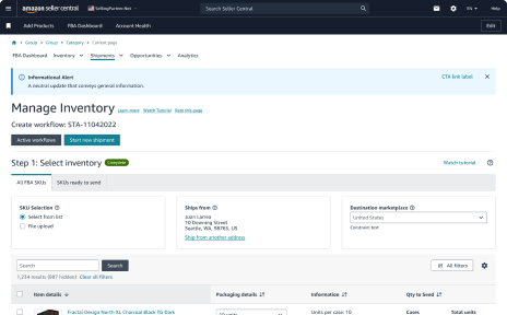
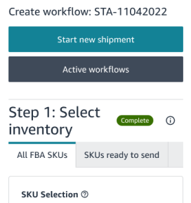
Examples from the visual refresh workstream showing proportional color usage, components, and patterns
Post-refresh enhancements
Mobile web & dark mode support
After the refresh, we added dark mode and optimized components for mobile, enabling new iOS and Android workflows. The first major rollout, a redesigned product listing flow, was faster, more reliable, improved key metrics, and was well-received by Amazon's sellers.

Our documentation site in dark mode
Community-components: data visualization
Our extended palette also enabled data visualization components. I created principles, basic patterns and a visual design guide – including guidance on how to use our newly extended color palette and pre-made accessible themes. Then I partnered with a design and dev team to implement complete the the Highcharts-based solution.

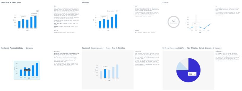
Data visualization color usage and basic UX guidance
Blueprints
My final project was to streaming front-end app creation. Previous teams’ proposals were rejected by builders for being too rigid and limiting innovation. I led a cross-org workshop to analyze top Seller Central pages which identified common archetypes (lists, details, dashboards, etc.), standardized page shells, and recurring patterns. These became Blueprints, and launched in beta at the end of 2024 as a set of customizable sample pages. Early feedback highlighted our documentation was unclear when communicating where the system was opinionated (or flexible), so we revised docs, Figma files, and code.
Looking forward, the vision was for builders to generate complete pages—with APIs, tracking, and measurement—via CLI or LLM prompts, based on archetypes, data, and user tasks.
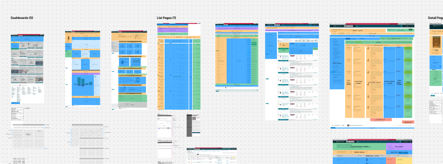
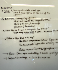

Early blueprints work to the final iteration
