The Problem
The existing navigation was a fixed horizontal menu with no framework for deciding what belonged. As the site grew, IA became chaotic: navigation was duplicated, placed arbitrarily, or named inconsistently. In the worst cases, users couldn’t distinguish one nav entry from another. Over the previous two years, experiments failed by overcomplicating the interaction design, ignoring behavioral patterns, and tying UI and IA changes together. This overwhelmed users and triggered strongly negative reactions.
Inspired by Jared Spool’s essay "Users don’t hate change. They hate our design choices,” we separated UI and IA work into two tracks, never iterating on both at once.
Track One: UI
Stabilize the UI without harming satisfaction
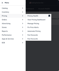
We needed a flexible, extensible navigation that worked across inconsistent page layouts. We moved from horizontal to vertical nav but faced technical limits on persistent display. After testing multiple models, we adopted a hamburger-triggered vertical panel. Though usability was initially a concern, testing confirmed users’ familiarity made this UI viable. We also measured users’ ability to find items using different interactions modes. The best prototype improving time-to-task by 61% versus the current menu, with our developer’s clever innovation solving key usability issues and assuaging skeptical users.
Beta launch
We launched the new UI as a beta, using research to carefully frame the benefits and avoid backlash. Over the next 15 months, we’d gradually transition users to the new experience, first as an opt-in experience, then opt-out, before gradually making it permanent. This allowed us to catch a few isolated technical issues while users adjusted to the new experience.

Initial navigation UI launch
61%
Time-on-task improvement
67%
Beta users retained
92%
Satisfied or neutral beta users
Adding new features
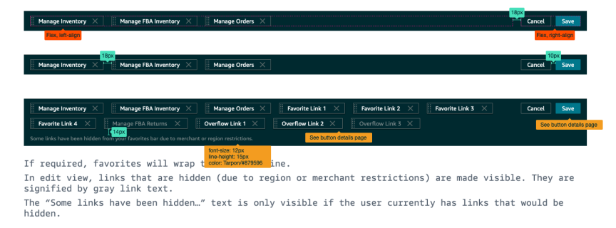
One reason for the extended beta period was to launch a feature that allows users to create a custom navigation menu, while retaining access to pages that aren’t needed every day, or removing access to programs or features that might be useful in the future.
“Honestly, if you could just put the top 5 pages I use [at the top of the page] that would be perfect.”
After eight months, we launched the favorites bar, a user-defined menu that allowed one-click access to core pages. Unlike bookmarks, they’d never get lost, fail to sync, or break when links changed. Adoption started at 12% but users responded positively, with one user creating a “thank you” thread on the forum Years later, more clicks went to the favorites bar than the main nav—proof of long-term impact.
“Thanks to this thread, I realized that there is such a thing. Thank you, I'm sure [the favorites bar] will be very useful for me.”


Navigation UI, Milestone 2
Track 2: Information architecture
Restructure content around clear principles
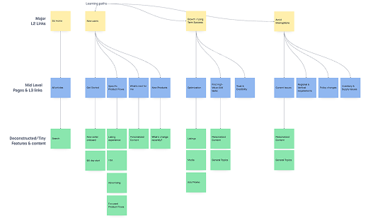
We created a system to halt the random nature of changes and additions to navigation. We defined three principals to begin: navigation should be stable long-term; new categories must map to core tasks, include multiple links, and follow a documented roadmap; links must land in Seller Central, contain the global nav, and point to a product home page or complete workflow. The rubric evolved but always relied on user data to validate changes.
Seller University
Seller University is one of the most important products for Amazon sellers - it explains the product, processes, and policies that enable seller success (and, if violated, can result in a very bad time). Yet, 56% of sellers didn’t know it existed and research showed a key factor in this was its placement under “performance.”
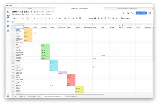
As our first test of our rubric and change management process, we began a series of sessions with users, asking them to sort topics (representing tasks and product types, not specific pages) into categories, as well as card sorting and tree testing, to build a picture of what content was related, and how to begin surfacing this to users, and co-designed various solutions in working sessions with the product team. In the end, we created a multi-variant test, with two organizational strategies, and two labeling options, with the winning variant driving a sustained +53% increase in traffic.
Catalog & Inventory Categories
These categories contained many critical tools for users to create and optimize the items they sell, yet it suffered from poor organization. Users complained about confusing labels, duplication, and unclear boundaries. To settle internal debate, we asked users to create their own categories and labels. This revealed Catalog was perceived as “item info” (adding, editing, media) while Inventory referred to physical goods and stock, whether it was in their hands or in a fulfillment center.
In the A/B test, unique clicks increased by 4% (Catalog) and 11% (Inventory), with no loss of traffic to any pages, signaling users were finding their tools without issues. Besides fixing user problems, these projects set a standard for using objective data to make day-to-day decisions with long-term impact.


A collection of co-working session and research response trackers
