The Problem
After uploading or manually creating a résumé, the information was duplicated on the user’s profile. People asked which was the “real” résumé. Both were, but the redundant UI implied two sources of truth. Simultaneously, multiple toasts and helper modules competed to “guide” people without offering a clear next step. The result was hesitation, unaddressed errors, and abandoned sessions. Our strategic problem framing: simplify the model, reduce competing CTAs, and make progress un-ambiguous.

An information architecture map, showing the duplication across experiences
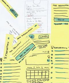
Initial prototype and user testing
New to the product, I first mapped the end‑to‑end experience and compared it against prior research and feedback. From that, I recreated the user flows to remove duplication and put actions where users expected them. I translated flows into wireframes and paper prototypes for complex paths, then applied a refreshed visual language. Early responses were positive for overall visual design, task clarity, and revised patterns for “safe” destructive actions, but this was balanced with lower engagement with the updated guidance UI. We came away from this with the insight that guidance needed to appear at the moment of intent.


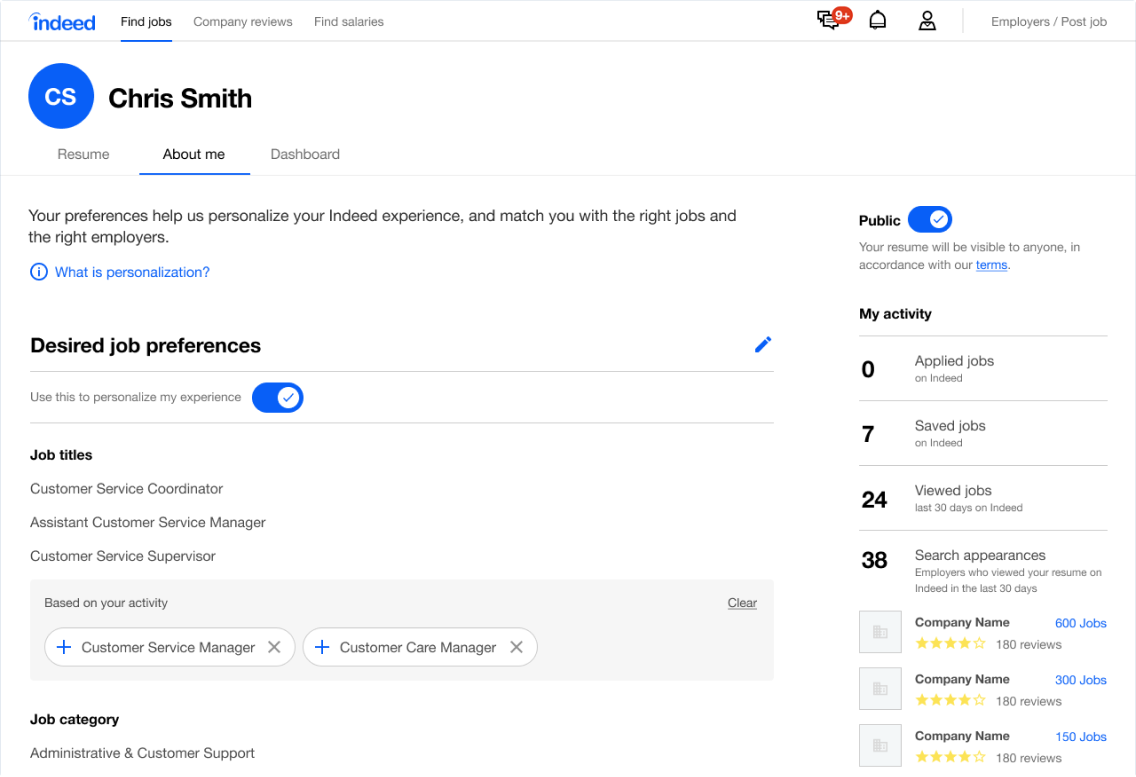
Version 1: Low and high-fidelity artifacts
Pivoting and proving value
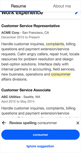
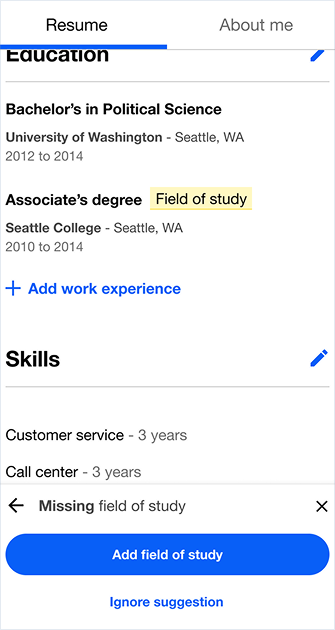
Our next iteration focused on mobile‑first guidance and closer alignment with Indeed’s visual system. Mid‑stream, leadership changed and support evaporated. The work risked being discarded as a “style” exercise. I reframed the program around the need to resolve our existing poor user outcomes with incremental proof by articulating the core UX problems, proposing a sequenced test plan, and showing how each change reduced confusion or lifted completion. This changed the conversation from taste to measurable progress.

Revised mockups, with mobile views
We needed to prove we were doing the right thing for users, despite early mis‑steps.
Improve our inputs
An early strategic choice was to focus on the most frequently used forms first to raise quality and completion. I worked with developers to re-arrange form fields, add input masking, improve validation, and switch to more appropriate inputs (for example, typed year instead of a 100‑item dropdown). My theory was that when it’s easier to supply correct data, especially on mobile, users will complete more fields. This increased edits in experience and education and justified a first production launch, proving low‑risk, high‑impact changes were possible.

Revised mockups, with mobile views
Reduce false-starts without harming intent
Our strategy was to resolve the model first, then tune the UI around it.
Upload and download were over‑weighted in the baseline UI and siphoned attention from starting a job search. Since Indeed only allowed a single résumé, we found many users saw the prominent “upload” button, and often restarted an unnecessary flow that would resent users back to an empty state even though that had just completed their résumé. I moved these secondary actions to a utility bar and strategically added friction at upload start. Upload clicks dropped by about two‑thirds. 97% of remaining clicks were confirmed by users and actual uploads stayed flat. Reducing false‑positive clicks without harming true intent, cleared noise and exposed the primary path.
I then separated the résumé from the profile and made the résumé the default landing page. The goal was to set one source of truth and help job seekers complete their content. In testing, we saw increases in new résumés (+2%), sessions with updates (+2%), résumé updates (+10%), and “quality” profiles (+3%).
Despite the churn, I earned back leadership trust and rescued the project by shipping measurable wins.

Future plans & strategic iteration
This approach turned a contentious redesign into a series of measured improvements, improving clarity for job seekers and creating a safer path for the organization to keep iterating. With momentum restored, the next steps focused on compounding gains (though I left Indeed before any of these tests launched):
- Update the header and merge the dashboard into profile to elevate task tracking, reduce tab‑hopping, and surface guidance at the right time.
- Revisit the right‑rail guidance to trigger help contextually and sustain engagement with résumé improvement tools.
- Continue evolving visual design within the system, now in service of the clarified model rather than as a parallel track.


A visual depiction of the intake process
