Results
15
Months in beta
10+
Research studies
4
Product launches
1
New mechanism
1
Unprompted thank you thread
Overview
My first task at Amazon was to improve the navigation system for Seller Central. The team had been trying to fix the navigation for two years without success. My role was to design an intuitive and scalable navigation UI, align the information architecture (IA) with user needs, and create a plan for sustainable growth.
The Work
01.
The Problem
The initial brief I received was that we were literally running out of pixels – we had a fixed, horizontal navigation menu and no consistent framework for deciding what belonged in the navigation menu, leading to an information architecture that was growing out of control. While those are real problems, it didn’t reveal the full scope of the problem.
First, the lack of a standardizing mechanism meant that pages could be duplicated, placed arbitrarily, and named without logic so that even if pages were not actually duplicated in navigation, users often couldn’t perceive a meaningful difference.
Second, our navigation UI experiments to date had been overcomplicated, making assumptions about user behavior rather than following Jakob’s law (and respecting prior art). They had also involved simultaneous IA testing, which amplified user stress and the combination triggered almost universal negative reactions.
02.
Change Management
Taking inspiration from Jared Spool’s essay, “Users don’t hate change. They hate our design choices,” we avoided overwhelming users by decoupling UI and IA changes. We worked on two parallel tracks: one for UI/feature development, and one for IA restructuring. Going forward, we never showed both changes simultaneously.
03.
Track one: UI & Products
We defined success as getting a stable population using an updated navigation UI without impacting behavior or satisfaction. While this doesn’t sound like an impressive goal, history showed us that even minor changes to navigation would cause a user revolt.
Basic UI prototyping
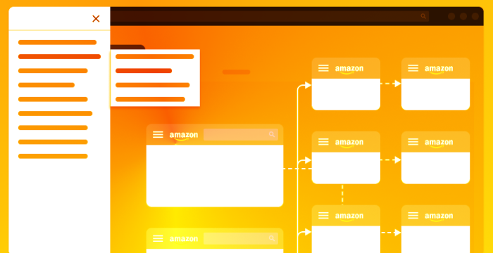
We started by prototyping UI designs that would meet two requirements: they had to be extensible and flexible enough to accommodate a large, complex navigation tree, and they had to work on every page. Seller Central was notably averse to standardization, even excluding legacy applications, so each page was on a different grid, with different degrees of responsiveness to browser width. As we aligned on a vertical navigation menu (to solve the first problem), we quickly ran into technical challenges that prevented us from having our navigation menu visible all of the time.
Like many teams, we settled on the “hamburger” menu to trigger a vertical panel. This was tested against several interaction variations and alternatives, including our current navigation menu. While we were initially worried about usability and discoverability, related work around change management and user’s general familiarity with the pattern showed that this was, at least, a viable option.
In fact, our best prototype (flyout menus on hover) indicated a 61.4% improvement in time-to-task in our new prototypes, versus prototypes that resemble the production code, and clever work by our developers solved most expected usability problems.
Our next step was to launch the new UI as an opt-in beta. Research had shown us how to communicate the nature of the beta to users, and the language that would best explain the benefits, leading to a 15 month testing period. After an initial “smoke test”, we slowly ramped up the beta test to be available to all users. Once our test population stabilized, we saw 3 core metrics indicating the new experience was healthy:
- 67% of users to opted-in remained in the beta
- 92% of those users were satisfied or neutral with the experience
Our next milestone
Part of the reason for the extended beta period was the fact that we wanted our second milestone to be live for the full launch: our favorites bar. The core insight behind this was the desire for users to customize their navigation to only show the pages they access regularly, without hiding pages that are only needed rarely or might be needed in the future.
Honestly, if you could just put the top 5 pages I use [at the top of the page] that would be perfect.
Sometimes, users give you the perfect path forward. Bookmarks might break, or get lost in a pile of other links, or not sync between browsers. But this? Building user-customizable favorites into navigation, negating the extra click from the transition to the hamburger menu.
We launched this 8 months into the beta period. Adoption took a while, with initially just 12% of users in the beta adding favorite, but those users responded positively to the feature.
Results
4
Average pages bookmarked per active user
47%
Very satisfied users (97% total neutral or better)
My favorite metrics
This led to my favorite success metric: an un-prompted thank-you thread from a user in our Seller Forums. This several other user chimed in that they noticed this and adopted it, leading to a few users stating that they’d re-enter the beta to try it out. My second favorite metric: several years after launch, the new owners of the navigation and site-wide IA told me that more users clicked the favorites bar than the main nav.
Thanks to this thread, I realized that there is such a thing. Thank you, I'm sure it will be very useful for me.
04.
Track two: Information architecture
In parallel, we wanted to ensure our nav structure could slowly be brought back in line with user needs. That meant addressing five specific problems:
- 1. Missing placement in navigation
- Duplicate (or duplicate-sounding) links
- Disparity between nav, title, & content
- Categorization issues (mis-categorization, category overloading)
- Lack of consistency
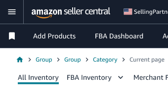
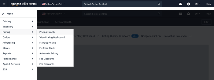
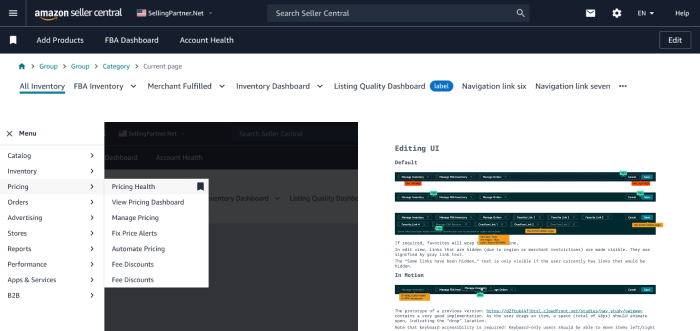
First, we set clear boundaries of ownership. We would be directly responsible for all global navigation elements - the header, footer, the nav menu itself, and the content in it - what we called L1 categories and L2 links. We would provide a component through the design system for in-product navigation and be a stakeholder in the content, but wouldn’t own it. Finally we would partner with teams who owned the utility functions in the header and footer, such as settings.
Navigation principals and the rubric
Second, we created a system to halt the random nature of changes and additions to navigation. We set three principals: navigation is stable over the long term; new L1 categories align to core user tasks and must contain multiple links, and must be a part of a documented, approved roadmap; new L2 links must be within Seller Central, they must contain the global nav, and they must be the landing page for a product, or a complete workflow within that product.
Although the rubric changed over time, it always focused on validating this information with real user data, allowing us to control and shape the growth of the navigation menu and ensure clear organization and naming.
Fixing the existing nav
As mentioned, we had many duplicative (or duplicative-sounding) links with a questionable organization structure, that resulted in undiscoverable products. The most extreme case we found was Seller University. Seller University is one of the most important products for Amazon sellers - it explains the product, processes, and policies that enable seller success (and, if violated, can result in a very bad time). Yet, 56% of sellers didn’t know it existed, and research showed a key factor in this was navigation IA. The link was placed under the “performance” menu, alongside unrelated products, and many users had no idea where to look.
Seller University
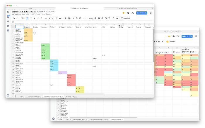
Using Seller University as our test case, we began a series of sessions with users, asking them to sort topics (representing tasks and product types, not specific pages) into categories, as well as card sorting and tree testing, to build a picture of what content was related, and how to begin surfacing this to users in a way that met our goals. In this case, we found that it was frequently grouped with our Seller Forums and News products, and that users responded positively to specific aspects of the product.
After two co-design sessions with the involved product teams, we were able to create a simple multi-variant test with 2 category labels and two different naming strategies, which resulted in a clear winner with a sustained 53% increased in traffic to Seller University, validating our process and rubric.
Catalog and Inventory Re-org
These two categories were a major source of IA issues - many products had unclear naming, add a product links were duplicated, and it was unclear why some items were in “catalog” and others in “inventory” - which contained over a dozen links for most users.
Repeating our process from Seller University, we gathered user feedback first. Our initial topic-sort showed that users tended to mentally group “item info” tasks as catalog or product tasks - adding something to Amazon’s catalog, managing photos or videos, etc. Inventory was everything related to physical goods - seller fulfilled or FBA other than actually fulfilling an order. This also gave us the opportunity to confirm that the reports should be centrally collecting under the “reports” L1 instead of being aligned to individual categories.
Results
86%
of surveyed Sellers preferred the new structure
4%
Increased unique clicks in Catalog L1
11%
Increased unique clicks in Inventory L1
In the eventual weblab test, this was the winning treatment with unique clicks under Catalog increasing by +4% and Inventory L1 +11% vs control, and no loss of traffic to the deduped pages or the moved reports (traffic shouldn’t be the only measure here, but many older pages didn’t have meaningful engagement metrics).
A playbook for risky changes. Better decision making. A real improvement for users.
Besides fixing immediate user problems, these work streams set a standard for using both objective and subjective data to make day-to-day decisions with long-term impact, and make progress where it was assumed none was possible.