Results
3
Rounds of A/B tests
1-2%
New résumés and sessions with updates
+10%
Résumé updates
66%
Reduction in incomplete uploads
Overview
Indeed‘s Jobseeker Profile was our prime source of information about our user‘s work experience and career goals, including their résumé. Over the years, the experience had become cluttered and duplicative. My team was asked to redesign the entire product, with a focus on simplifying the experience to encourage higher-quality résumés and more successful job applications.
The Work
01.
The Problem
A duplicative experience
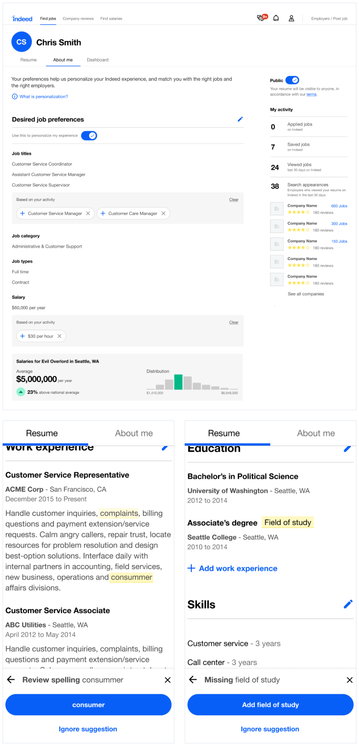
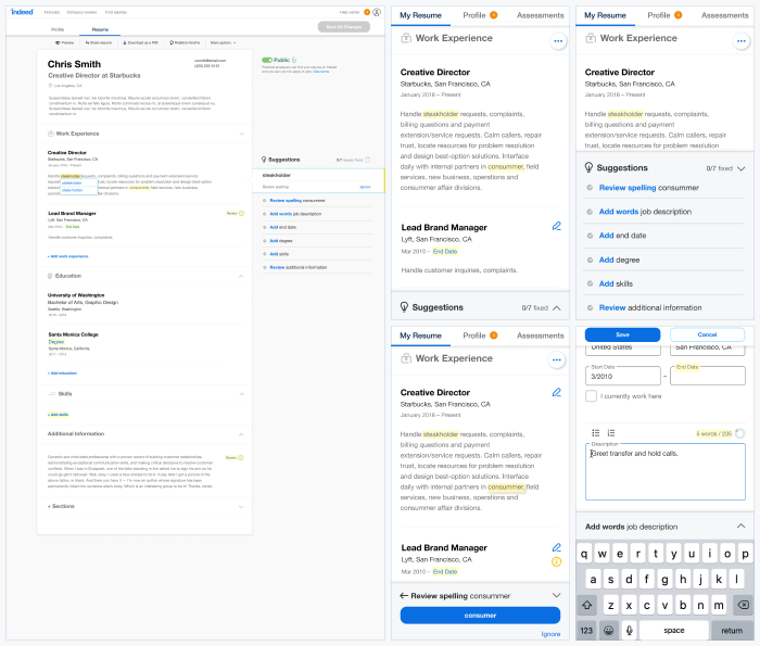
The best illustration of the problem our users faced was that after creating or uploading a résumé, it was duplicated on your profile page. Our users regularly complained that they didn't know which was their “real” résumé (answer: both were real - the UI was completely redundant). This was compounded by a habit of displaying multiple message modules, toasts, and tooltips all competing to “help” the user instead of provide a clear next step. Users found this overwhelming, and analysis showed a significant number of un-addressed errors and abandoned job searches.
02.
Initial prototype and research
I had only recently joined Indeed, so to learn more about the product I mapped out the current experience and compared it to existing feedback and research, before rebuilding the user flows to remove duplication and get the content in the places users expected.
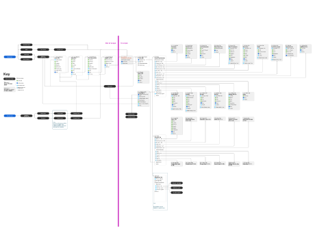
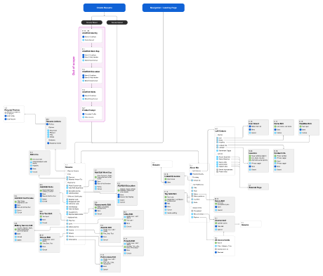
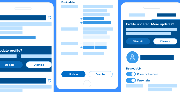
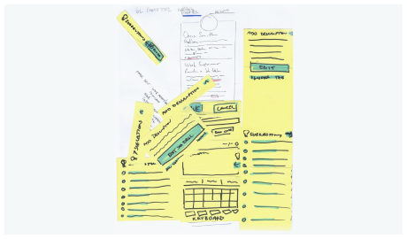
These were translated into wireframes to define the hierarchy and functionality we’d want to prototype with our users. I created paper prototypes for some of the more complicated workflows before we applied a new visual design language (created by another designer). In testing, reactions were generally positive : no one said it reminded them of Craigslist (a common criticism of the then-current design system), and many of the improvements – such as safer delete patterns – made users feel more comfortable editing their information, but users weren't engaging with the guidance and suggestions in their new location.
03.
Pivot & internal changes
In the next round of testing, we focused on encourage users to engage with guidance in the mobile UI. We also update the visual styling to be closer to Indeed's styles. Before we could get too far, our team was re-organized under new leadership, and this project became toxic.
It turned out we did not have our senior leadership's support, and any good work we were doing was buried by the appearance of subversion. I spoke up in our post-mortem that I wanted continue with the project – that we shouldn't discard the good work that was done, even if the visual design was problematic. I presented a plan to product and design leadership explaining how our UX improvements solved core problems with uploading and maintaining a profile, alongside a plan to work iteratively and test incrementally.
We needed to prove to our leadership that we were focused on doing the right thing for our users, despite early mis-steps.
04.
Proving our value
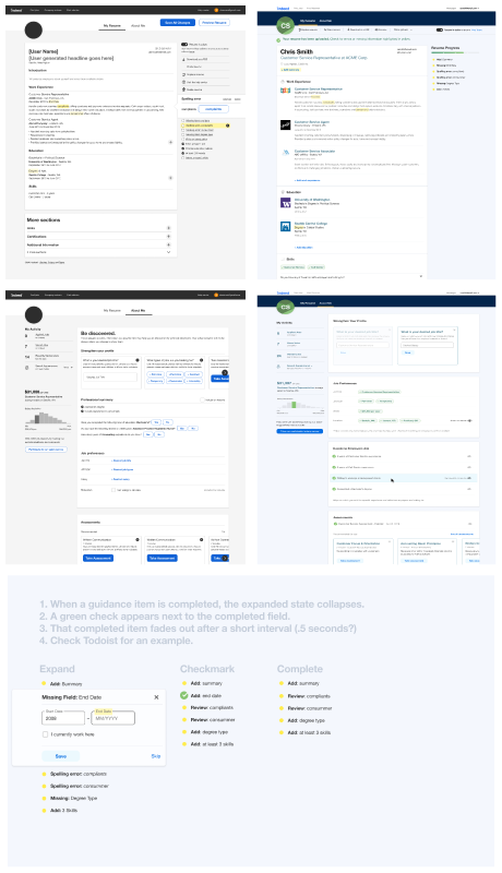
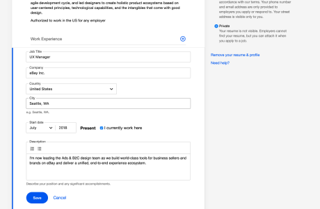
Improve our inputs
Our first step was to update our forms to find ways to improve completion rates and raise résumé quality. We added input masking, improved validation, and updated our inputs to be faster and easier to use – such as making ‘year’ inputs a text-based number input instead of a dropdown with 100+ years). These resulted in a significant increase in the number of edits in work experience and education, leading to the first launch to production.
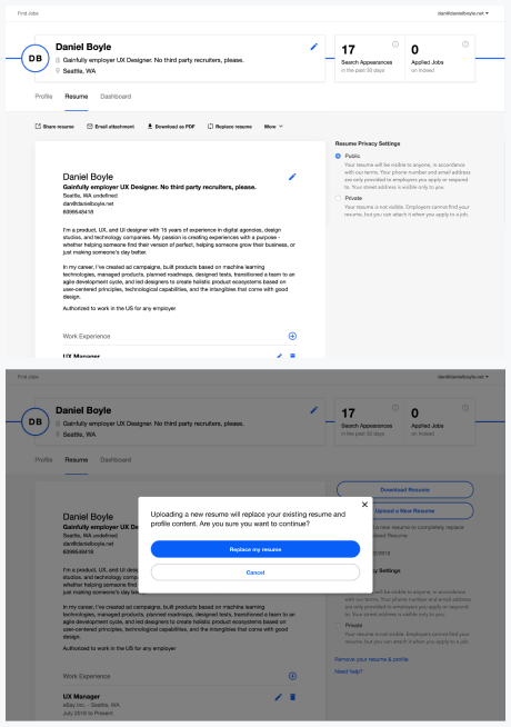
Eliminate junk actions
Next, we moved the secondary actions – upload and download – into a utility bar. The baseline experience gave these too much prominence. Instead of starting a job search, users would frequently attempt to upload a new résumé, as this button was the most obvious CTAs. Indeed only supported a single résumé, so this would start the upload process all over again. We also added a confirmation dialog to start of the upload process. Clicks on the upload button dropped by two-thirds, but 97% of these clicks would be confirmed and the actual résumé uploads from this page stayed flat – eliminating junk traffic to the uploader without harming the users who actually wanted to upload their résumé.
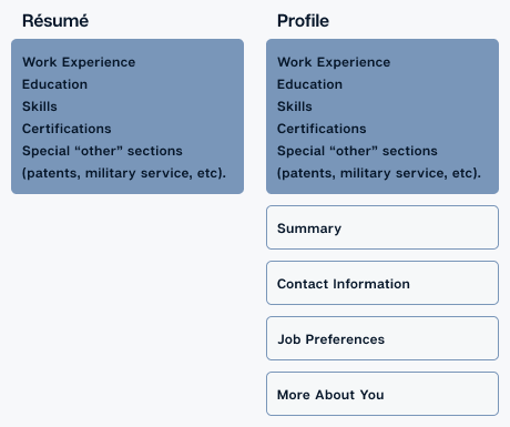
Deduplicate user content
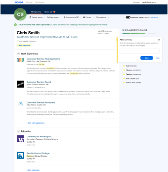
The third test was to separate the résumé content from the profile, making the résumé the default landing page. Our goal was to eliminate confusion, and help our users better complete their content. In testing, we saw significant increases in new résumés (+1-2%), sessions with updates (+1-2%), increased résumé updates (+10%), and more ‘quality’ profiles (+2-3%) than the old, duplicative experience.
Despite the churn, I earned our design and product leadership’s trust, and was able to rescue an entire workstream.
05.
Future plans & more iteration
Although I left Indeed before this was completed, we had several more changes planned to continue improvements to the page. We would start by updating the header UI and merging the dashboard into the profile – increase usage of that tab, unifying task tracking for jobseekers, and better integrating tools such as salary guidance.
We would also revisit our guidance UI in the right rail, as initially planned, with a goal of driving more engagement with our résumé improvement tools, as well as evolving the visual design of the résumé and profile (while staying within the design system this time).