NJ Transit Train Door Usability
It was a source of amusement for regular commuters to watch tourists struggle with the doors between cars on NJ Transit trains. As strange as it seems to watch people struggle with the concept of pressing the glowing green “open” button, the fact is, the train doors were a usability wreck and far too many people had problems with the doors themselves, through no fault of their own.
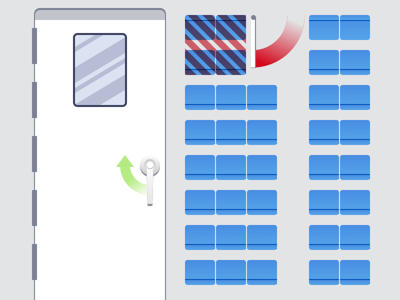
First, NJ Transit runs train cars from multiple generations, each with their own door style and problems and each train may contain cars from multiple generations, so you may have 2 or 3 different styles of door on each train.
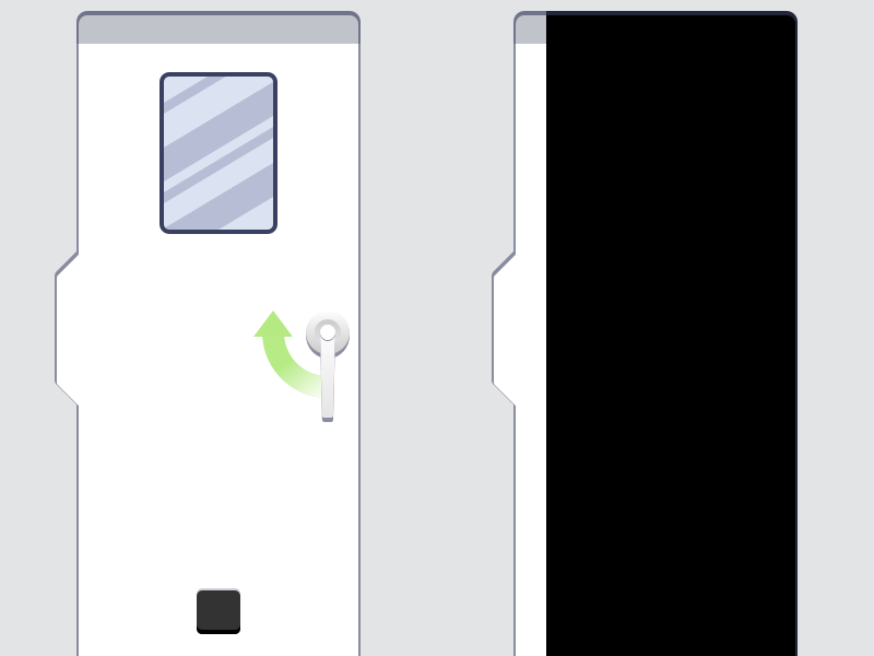
The oldest doors have a relatively standard lever – twist and push/pull as applicable. The good news is that most passengers understood what to do. The bad news is the these doors were incredibly heavy. I am a relatively large adult male, with proportional strength - and I consider these doors unacceptably heavy. When my arms were full, or after having elbow surgery, I struggled, to say the least. A smaller person, or someone with reduced physical capacity would struggle. Someone in a wheelchair would find it impossible. The push/pull nature of the door itself causes problems. Because it opens into the train car (which is frequently standing-room-only) it forces people to reshuffle their positions, and blocks seating inside the car - reducing the ability for passengers to exit promptly when the train arrives at the platform. Combined with regular failures of the locks meant to hold the door open, this design is a failure. Fortunately, these cars are slowly being removed from service.
Rule 1: Doors should require minimal strength and physical ability to open.
Rule 2: Doors should not intrude on the space inside the train car when open.
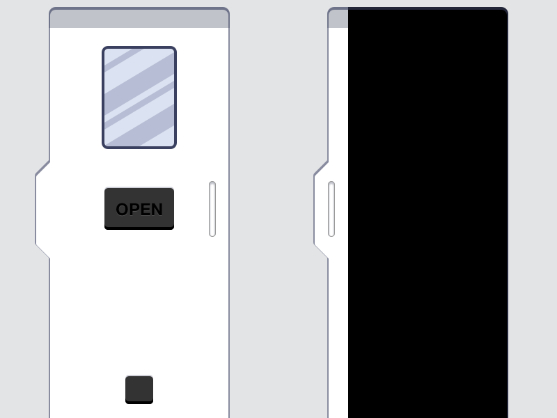
All newer trains come with sliding doors that solved the space intrusion issue, but bring their own problems. The first common type, seen on older cars, places two large switches in the middle of the doors themselves. One sits just below the window, the other at the bottom. There are handholds on the door in case you need to manually open it. This is, as a baseline, a good design. Nearly any user can press the button. A standing user can press the higher of the two. A passenger with crutches or in a wheelchair can toe the lower switch to open the door. The two problems are the construction of the buttons and the placement of the handholds. First, the buttons are black plastic, with a recessed arrow, and a “push” sticker. Guess how many of those stickers are still on the button after years of service? I imagine the percentage is in the low single digits. Many new passengers wouldn’t realize what the buttons were for. Instead, they’d wrestle with the handholds, until told otherwise.
Rule 3: The mechanism should age well - easily worn stickers or paint are not sufficient.
Rule 4: The manual backup should not appear to be the primary method of opening the door.
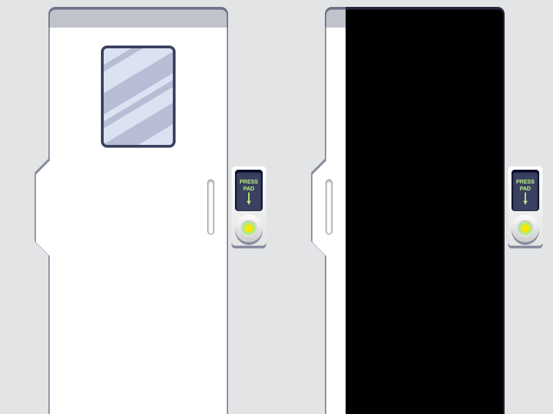
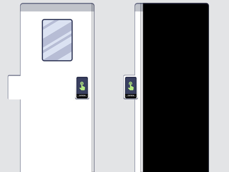
The newest cars came with sliding doors with a small yellow button with a green illuminated surround, and an illuminated panel that says, “Press pad” off to the side of the door. Here, users would often miss the button entirely and try to pull the door open, or press the illuminated panel (which resembles a “pad” far more than the button below. I assume that this is also due to ‘tunnel vision’: a train is an linear experience. You walk forward, or back - rarely looking or turning to the side. Coupled with lifetime of pattern recognition that tells us “the way to open a door is on the door itself, no wonder passengers struggle.
Rule 5: The mechanism needs to be in a natural position, and any UI clues should be in the user’s natural field of view.
To summarize, we’ve learned the following things about how (not) to design doors for train cars:
- Doors should require minimal strength and physical ability to open.
- Doors should not intrude on the space inside the train car when open.
- The mechanism should age well - easily worn stickers or paint are not sufficient.
- The manual backup should not appear to be the primary method of opening the door.
- The mechanism needs to be in a natural position, and any UI clues should be directly in front of the user’s field of view.
To rules 1 and 3, I’ll add that the doors must be accessible to visually impaired users.
Solutions
When considering solutions, I am setting one ground rule: All doors must be opened by a positive interaction. What I mean is, automatic doors are off limits. Both passengers and train staff frequently move about the train car, which may also be overcrowded, and have passengers standing near the door. A door that would open whenever it senses a body in front of it would open unnecessarily, creating safety (the areas between cars are relatively dangerous) and comfort issues (intrusion of wind/track noise, and temperature shifts from outside air. Any switches must similarly require a definitive interaction, not just a light touch.
One solution involves combining a common pattern - a turning lever, and a sliding door. A lever sits on, for example, the right side of the door. A simple turn to the left, and the door slides open. The weight of the lever should be set so that one or two fingers are strong enough to move it and trigger the switch, which is what actually moves the door. We don’t need the user to physically push the door aside. As an extra benefit, should the mechanism fail, the exact same interaction becomes the manual operation method: turn the lever, and physically slide the door to the side.
Unfortunately, this solution doesn’t work for users who don’t have use of their hands or are otherwise unable to reach the lever. I see this causing problems for users in wheelchairs, or even just someone with their hands full. A foot switch placed a few inches off the ground on the door should make this usable. In an idea world, where space is not at a premium, Apple’s solution to move the switch to a post several feet away from the door at their new visitor’s center is the preferred method, but in the confines of a train car, suboptimal.
For an alternative solution, we could revisit the illuminated panel, but with improvements. We could make the panel and button essentially one mechanism - pressing it anywhere will open the door. We can use a language-neutral approach for sighted users and provide additional information for crew members by switching to icons - a green touch icon, a red lock icon, or icons for medical emergencies or other notifications for crews as they move up and down the train.
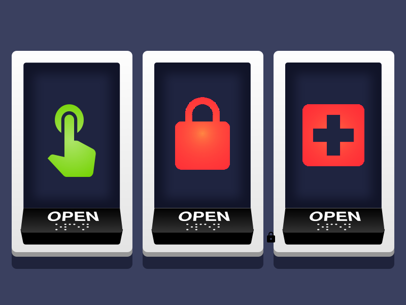
Visually impaired users can still use this via raised letters and braille, which are offset from vertical at a natural reading angle, in the natural position for a door handle - where a passenger would reach by default.
To reduce the chances of someone trying to wrestle the door open, we can build a graspable edge into the door, which can be used to slide the door open, but is not nearly as obvious as a handle.